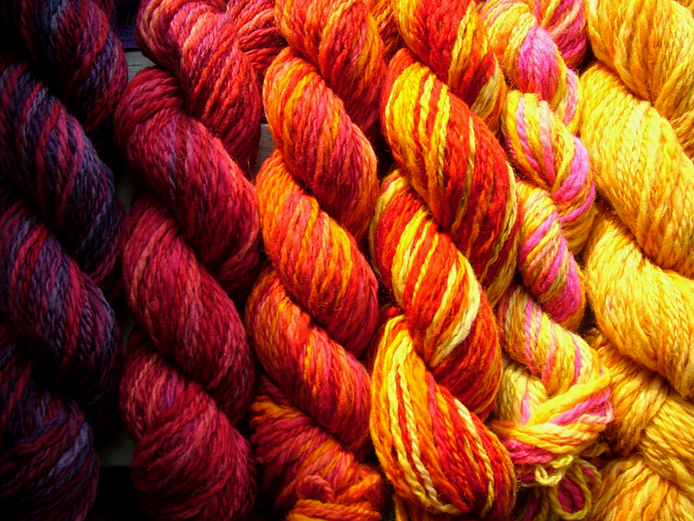
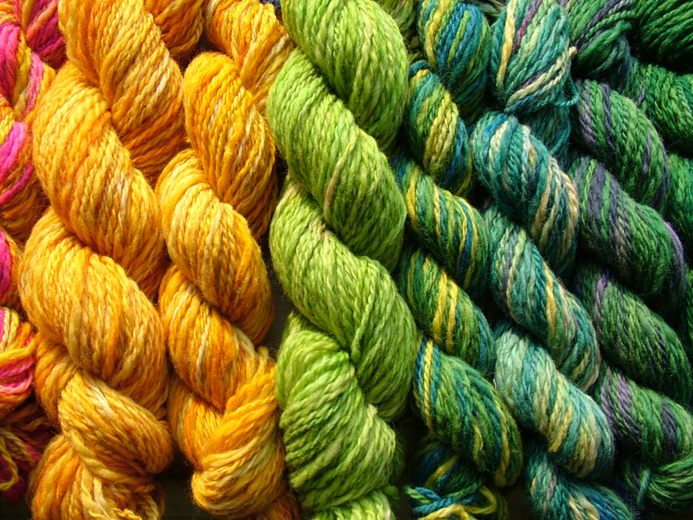
Paint is just the beginning; color should fuse every detail from floor finishes, to fabrics in creating a harmonious room.Creating the perfect palette for your house needn't be daunting. To begin give your inner child a little nudge and figure out which colors you truly like best.
Paint chips and magazines are of course a good starting point and as I have said before look at everyday objects and my personal favorite nature as well for inspiration.Where to start is simple start to keep a folder of photographs, paint chips, swatches and other favorite items. I call this my "design inspiration file." What I have truly learned about this file is my style and my overall color palette preferences. I tend to pick similar items for my folder which gives me a "design thumbprint." Soon your palette and style will emerge and you will have a jumping off point.
Okay, so let's start with a scheme. If you are decorating rooms from scratch make a list of all the necessary components as well as the extras.As you travel the road of personal design let the color be your compass as you piece the space together.
I will make suggestions on color, but keep in mind they are merely suggestions not decrees. Just remember when it comes to color, the only absolute is choosing your favorite.
Let's start with the kitchen: Make a list of the elements that you will have or need in the space. Select colors that are warm and nurturing. Mustard yellow or gold tones provide visual temperature just right for a more traditional kitchen. When you head towards a palette made up of cooler blues and grays-that will give a fresh, updated, and modern feel to the space.
In the bathroom: Light palettes function as backdrop for standout pieces that have a more dramatic colors or sculptural lines. Use contrasts in small doses. Pale gray and blues will enrich what might otherwise be a more severe palette. For a soft spa like feel select light and airy colors of turquoise and blues with white or cream trim. Soft greens are also a great spa like color palette you could splash in some contrasting colors for light interest such as soft pink and nickel faucets. Refer to a color wheel to identify pairings.
Bedroom Palettes: Create a bedroom that is soothing and sophisticated. Plum can surprise you with its seemingly young and playful touch, but paired with graceful grays, taupe, subdued browns, or chalky whites, the final end point can give a very grown up feel that is elegant. Punch in some contrast with prints and texture.Living Rooms: Reds and gold can be challenging to work with, but by grounding them with oatmeal or moss green can really bring them together. Take your cue from nature and blend the creamy white of a peony with the vibrant hue of a red roses and Marigold's. When you are selecting vibrant colors you just need to anchor them with calming accents. Oatmeal is a great neutral.
Bedroom Palettes: Create a bedroom that is soothing and sophisticated. Plum can surprise you with its seemingly young and playful touch, but paired with graceful grays, taupe, subdued browns, or chalky whites, the final end point can give a very grown up feel that is elegant. Punch in some contrast with prints and texture.Living Rooms: Reds and gold can be challenging to work with, but by grounding them with oatmeal or moss green can really bring them together. Take your cue from nature and blend the creamy white of a peony with the vibrant hue of a red roses and Marigold's. When you are selecting vibrant colors you just need to anchor them with calming accents. Oatmeal is a great neutral.
Enjoy and happy decorating.
No comments:
Post a Comment